Brand Strategy and Integrated Reporting Corby
- Brand Strategy
- Copywriting
- Design
- Production
- Website Design
- Website Development
Shifting strategy
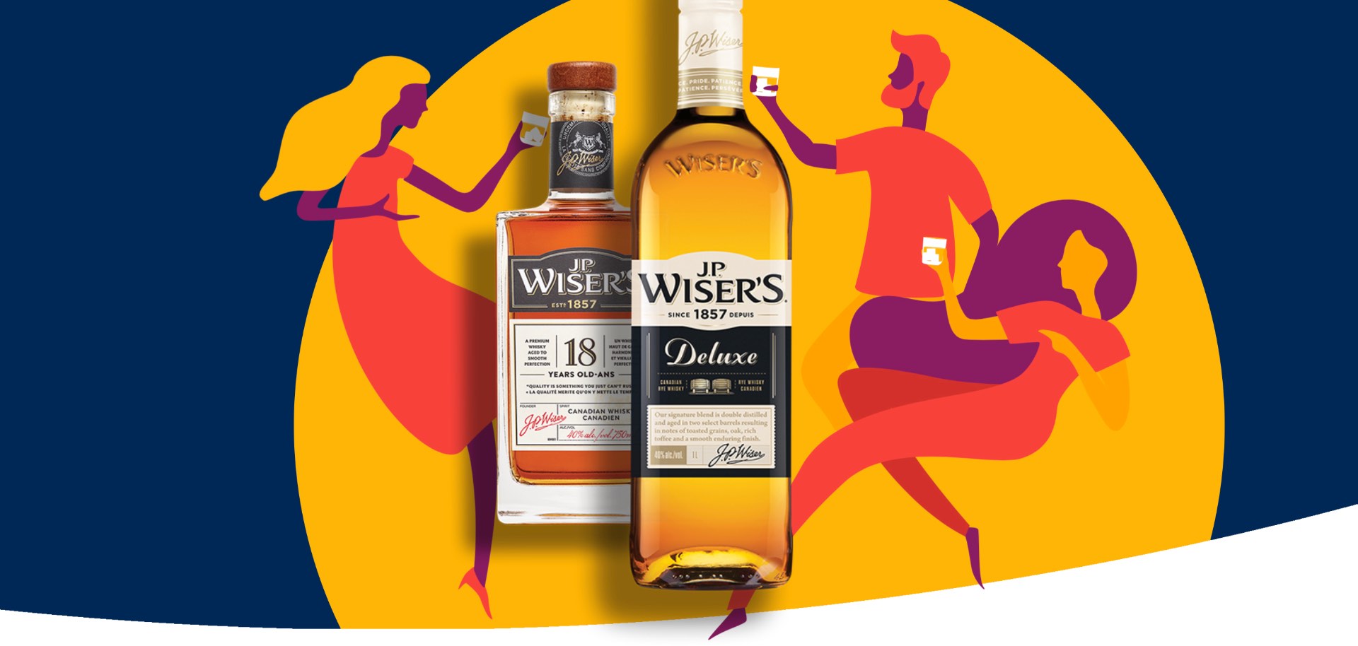
Corby is a world-leading marketer and distributor of spirits and wine, representing Canada’s top-selling brands. With a history that stretches back 150 years, it understands the importance of a well-defined brand. However, in 2013 the Corby brand itself had become somewhat outdated. Following the sale of much of its manufacturing business (and the acquisition of several spirit and wine labels), Corby was concerned that there was an overall misalignment between the brand and where Corby was headed.
Positioning purpose and passion
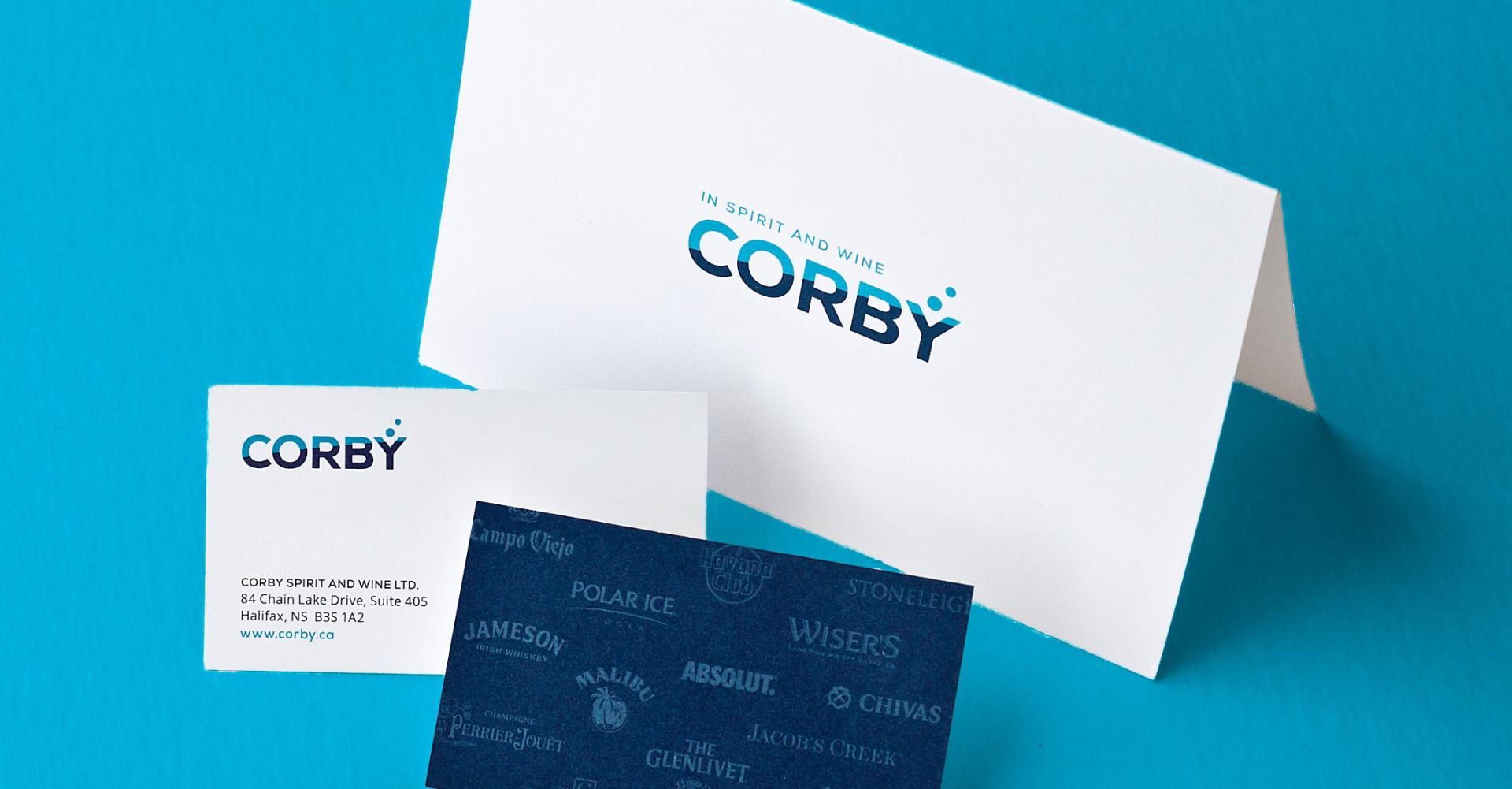
A clear foundational change was needed to update the company name. The Corby name carried a great deal of value and goodwill, but changing from Corby Distilleries to Corby Spirit and Wine put forward a far better representation of the company’s actual scope of operations and future plans. Having worked together for many years, Corby’s executive team and Works Design collaborated closely as we developed the new visual identity. A shared objective was to reflect a modernized company, but one with a proud legacy. Our work with Corby is also underpinned by a persistent creative challenge: how do we design things that say “liquor brands worth celebrating” and “responsible corporate conduct” at the same time?
The new Corby brand has a bold sense of originality and spirit. The logo combines two vibrant blues, which create a more contemporary look, and subtly convey the company’s partnership with Pernod Ricard. Strong typography gives the identity authority, while the two circles over the “Y” express Corby’s spirit and conviviality – important values when it comes to its employee culture. The reverse of the business card is adorned with a wallpaper made up of Corby’s flagship products, underscoring the company’s value and legitimacy as an importer of top-selling brands.
A brand worth celebrating
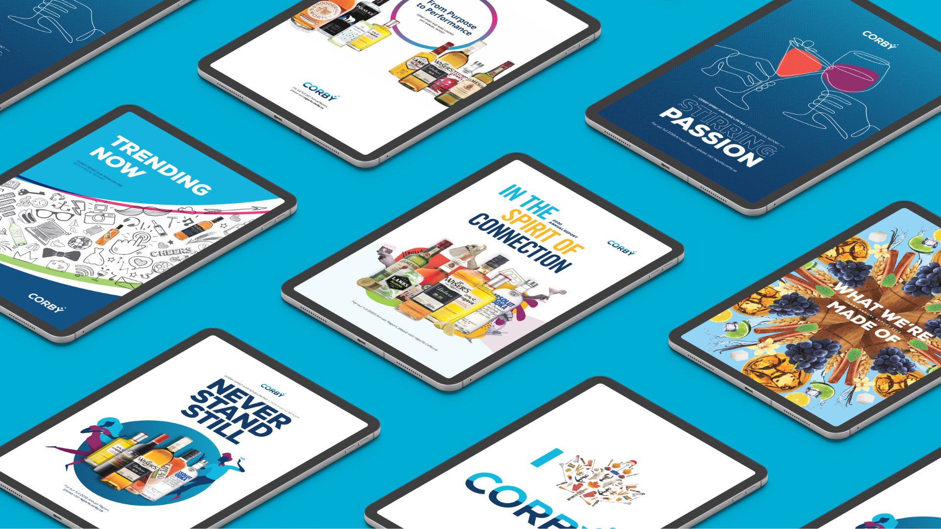
We continue to infuse a bold sense of originality and spirit into Corby’s communications materials. In the 2014 Annual Report, we highlighted the launch of the Works-designed identity. The resulting report, which uses a bold palette, ingeniously configured Canadian iconography and clever “only in Canada” headlines to help show how Corby keeps moving closer to its goal of becoming the leading spirits and wine company in Canada.
Spirited reporting
Corby has a simple mission: “Create win–win memorable experiences.” And the company’s 2016 Annual Report – the first to be published online – embodied that bold spirit. Each year, we continue to push creative boundaries. Every report has leveraged the full range of digital storytelling strategies: video, photography and, as always, outstanding design. In short, we focus on releasing a report that’s stunning, and actually fun to read. In 2018, Corby’s lively and responsive report was recognized by the Awwwards (for its distinctive and effective design) and by the IR Awards (for excellence in online financial disclosure).
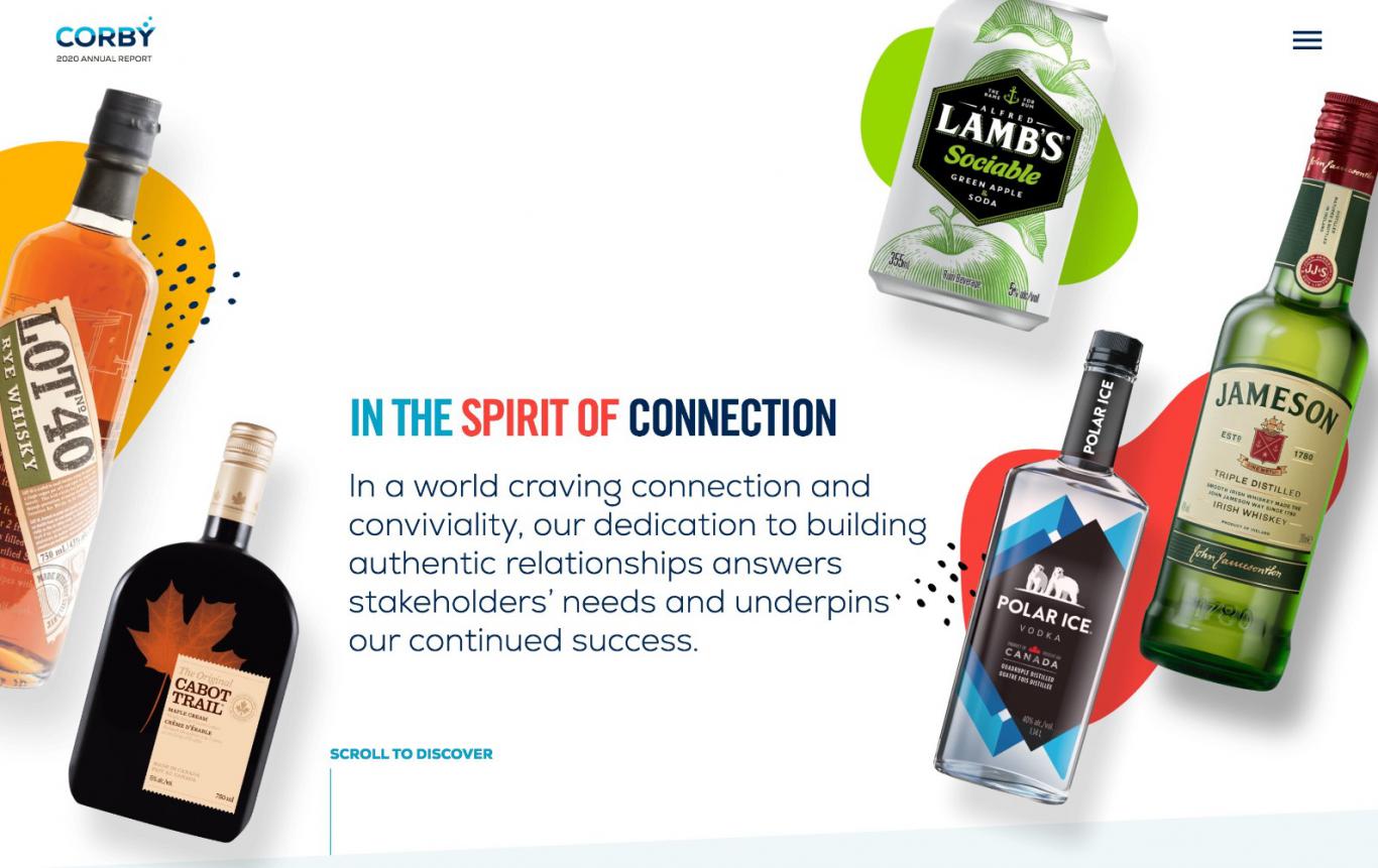
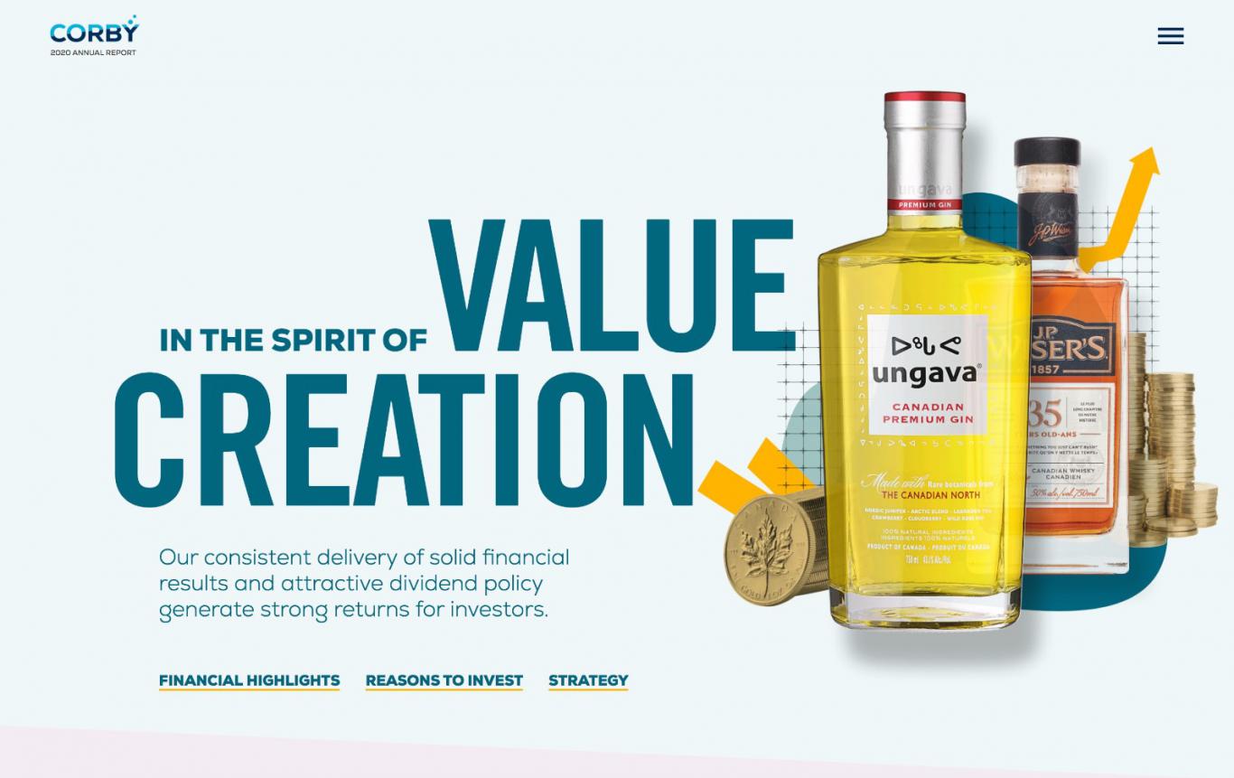
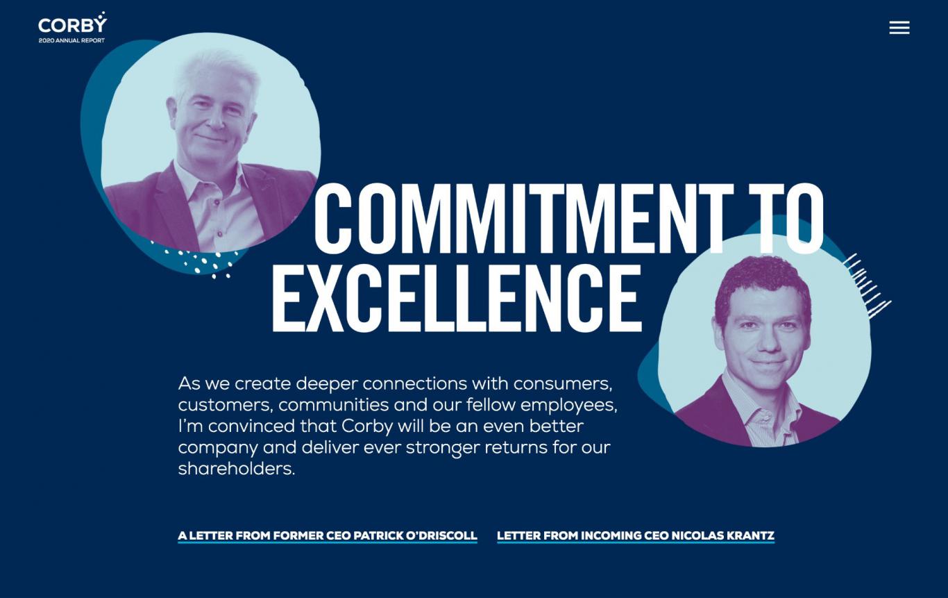
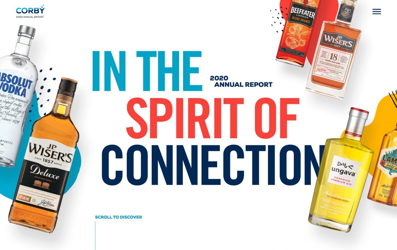
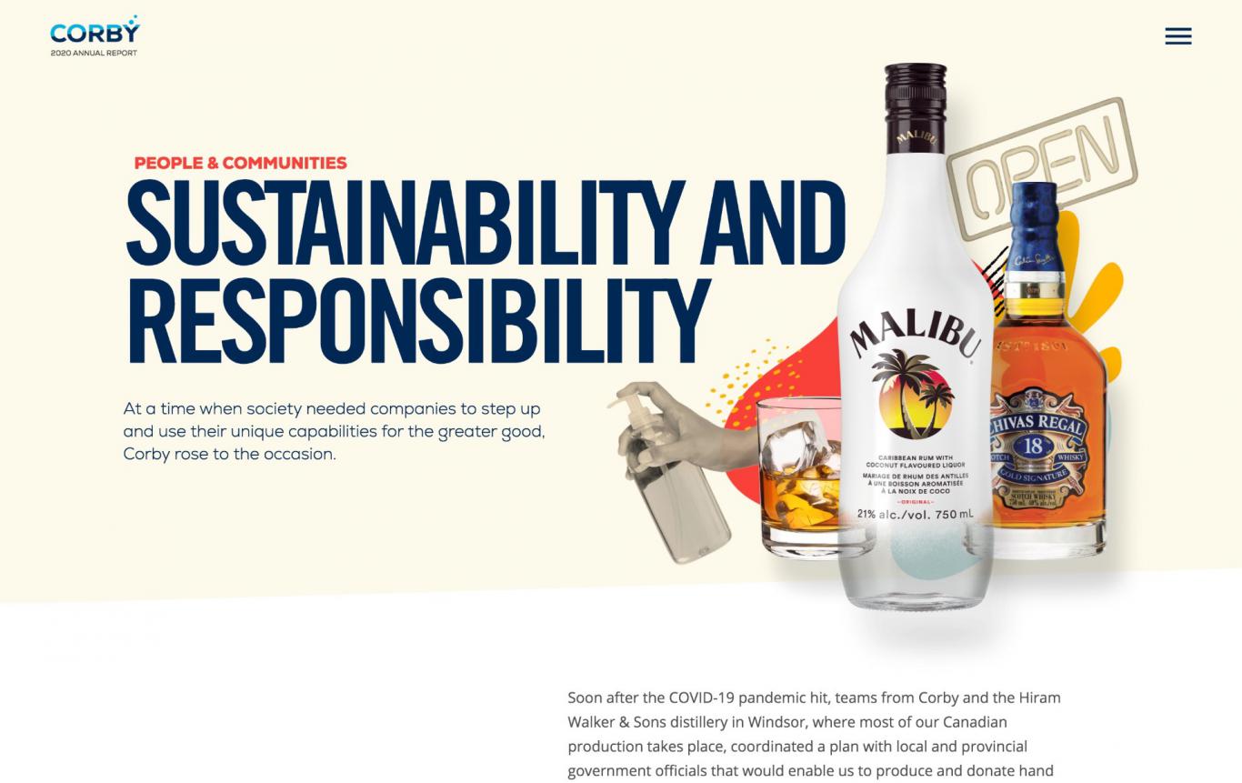
Launched in the summer of 2020, Corby’s latest report seeks to communicate financial results in a way that solidifies and validates the entrepreneurial spirit of Corby – both in its brand portfolio and as an organization overall. With a timely theme, the report engages investors and celebrates employees in equal measure. “In the Spirit of Connection” centres around resilience and courage, honouring Corby’s people and partners as they continue to embody the values of empathy, creativity, collaboration and boldness – even in the face of the COVID-19 pandemic. Prudent and investor-focused, the adaptive design highlights a brand portfolio that is second to none, and a company well-positioned to thrive.