A Brand Is More Than a Logo
You can feel the energy in the room – the excitement a client feels when they’re ready to evolve their brand. For many, it can be an opportunity to embody new strategic positioning, engage audiences through refreshed messaging and create a more ownable visual impression. A rebrand is a public, tangible and often symbolic way to signal a new chapter.
But just as the ideas start flowing, we sometimes hear: “Oh, and don’t touch the logo.”
We get it. A logo can feel personal, invested in legacy and something that should stand the test of time. If there are strong convictions to keep it, we delve into those reasons to bring out the best result. Clients can be surprised that even subtle design shifts can bring their mark into better alignment with a refreshed identity. If they’re curious, we’ll also roll up our sleeves to create something new that still honours their history. And together, if we find that the existing logo can truly move forward with the organization, we focus on its strengths to weave these into the larger brand story. Open conversations like these are what ultimately lead to the most successful solutions.
That said, the logo is just one piece of the puzzle. Before making any decisions, we always recommend stepping back. Let’s uncover what’s driving the rebrand, what’s evolved and what story needs telling. Only through that discovery can we shape a brand experience that is thoughtful, aligned and meaningful.
Looking Beyond the Logo: Discovery First
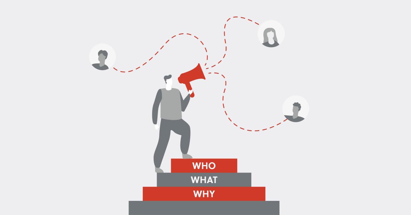
A brand is much more than a logo. It’s an organization’s identity, voice, values and reputation. And because it carries so much weight, the beginning of a rebrand should first focus on the bigger picture:
- What triggered the need for change?
- What’s different now about the company’s purpose or vision?
- How has the audience shifted or expanded?
- What’s the story we need to tell moving forward?
When approaching these types of projects, we dive deep into the company’s culture, voice, mission and future aspirations. A real rebrand isn’t simply a design project; it’s also about helping clients foster a holistic brand mentality for their organization.
Once these foundational questions are explored, the next consideration is how far we want to go.
Refresh vs. Rebrand: Real-World Examples
Some brands benefit from an evolution rather than a complete overhaul. Maybe their values and audiences haven’t changed, but the look feels dated. Or perhaps the company has grown, yet its core identity remains solid. In other cases, the goal is to stand out in a crowded market without losing brand equity. In these scenarios, modernizing might mean updating typography, refreshing the colour palette, softening the tone or making subtle logo adjustments – all while staying true to the foundation.
Oxford Properties Group and Ontario Teachers’ Pension Plan (OTPP) are examples of identities we helped shape years ago that still stand today. Their logos remain recognizable, while the brand around their logos has evolved over the years.
At other times, brands need a complete transformation, often triggered by major shifts like new leadership, changing markets, expanded services or a desire to overcome a dated or negative reputation. In these cases, it’s about more than a new look; it’s a full reset, which can include new strategic brand positioning, messaging development, visual identity and web presence all working together to reflect the company’s new trajectory.
For LiftED Literacy and Leadership, we created a vibrant brand identity (including a new logo and website) that reflects the organization’s playful spirit while ensuring that the importance of its mission still shines through. Targeted to the individuals, families and sponsors that use the company’s services, the site features intuitive navigation, straightforward language and responsive design, making it easy to find important information when it matters most.
While both approaches to evolving a brand are valid, it’s important to really understand what it is that is trying to be achieved before jumping straight into tactics (including or not including the logo).
Why Keeping the Logo Can Be a Strength
When we partnered with Kaiser Aluminum on their brand refresh, the logo remained as a strong beacon of their history, but everything around it evolved.
The refreshed website focused on telling a broader, richer story – one that celebrated Kaiser’s leadership in sustainability – by showcasing its nearly century-long history and, most importantly, putting its people front and centre. Striking black-and-white photography of materials and authentic portraits portraying employee pride gave the brand a bold new look without losing the equity they had already built in the marketplace.
By keeping the logo intact and reimagining the surrounding brand experience, Kaiser was able to honour its past while confidently stepping into its next chapter.
The Journey Is the Reward
At the end of the day, a rebrand or refresh is a journey that invites exploration, collaboration and creativity. Through open communication and shared learning, we help clients feel confident every step of the way, whether their logo is changing or not. And by helping them uncover what their initial excitement really means for their purpose and future goals, there’s a stronger, more focused brand ready to move forward with them.