LiftED Literacy and Leadership
Building a brand that empowers Canada’s next generation of leaders
The Goal
After decades as The Leacock Foundation, the charity reached a crossroads. Its identity felt dated, its mission unclear and donor engagement increasingly challenging. To continue making an impact, the organization needed a renewed sense of purpose and a stronger connection to its audience.
With a new name in hand, LiftED Literacy and Leadership, the foundation enlisted us to bring its mission to life: empowering young people with the critical and creative thinking skills needed to become confident leaders, now and in the future.
- Creative strategy
- Digital marketing
- Visual design

How We Helped
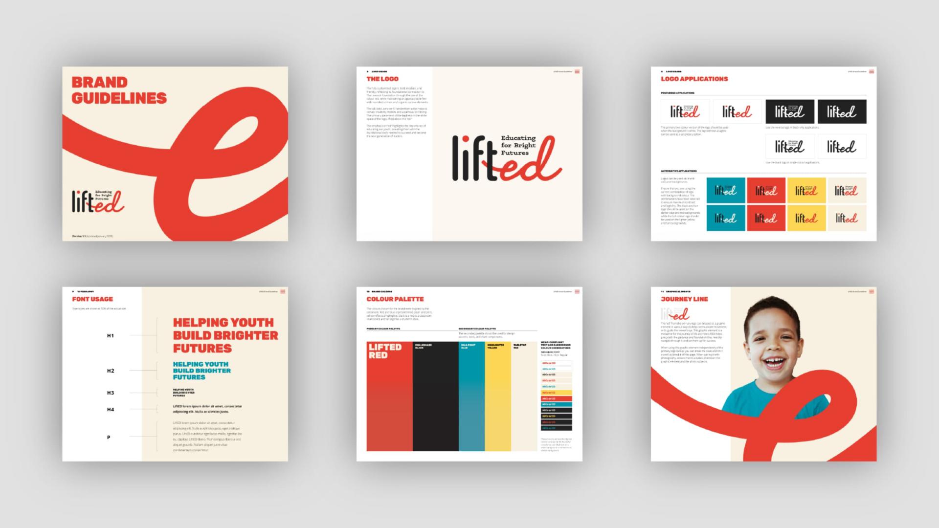
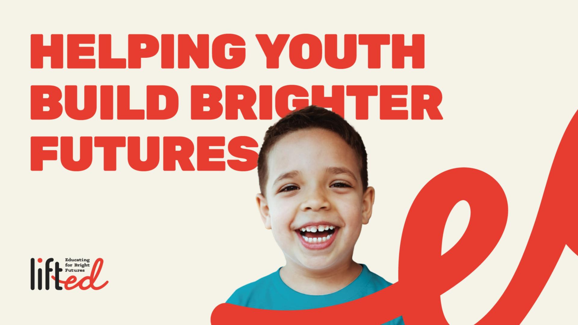
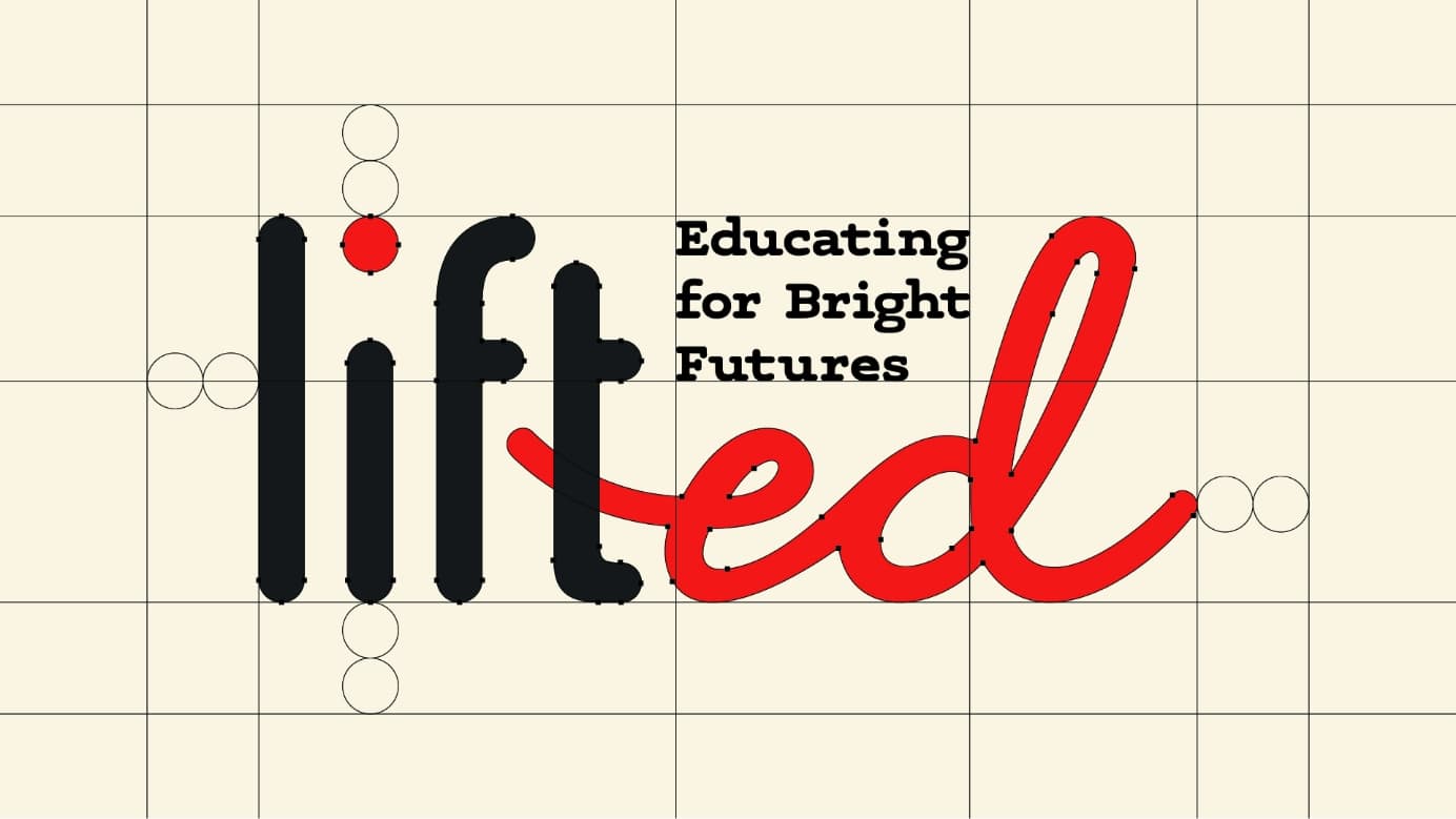
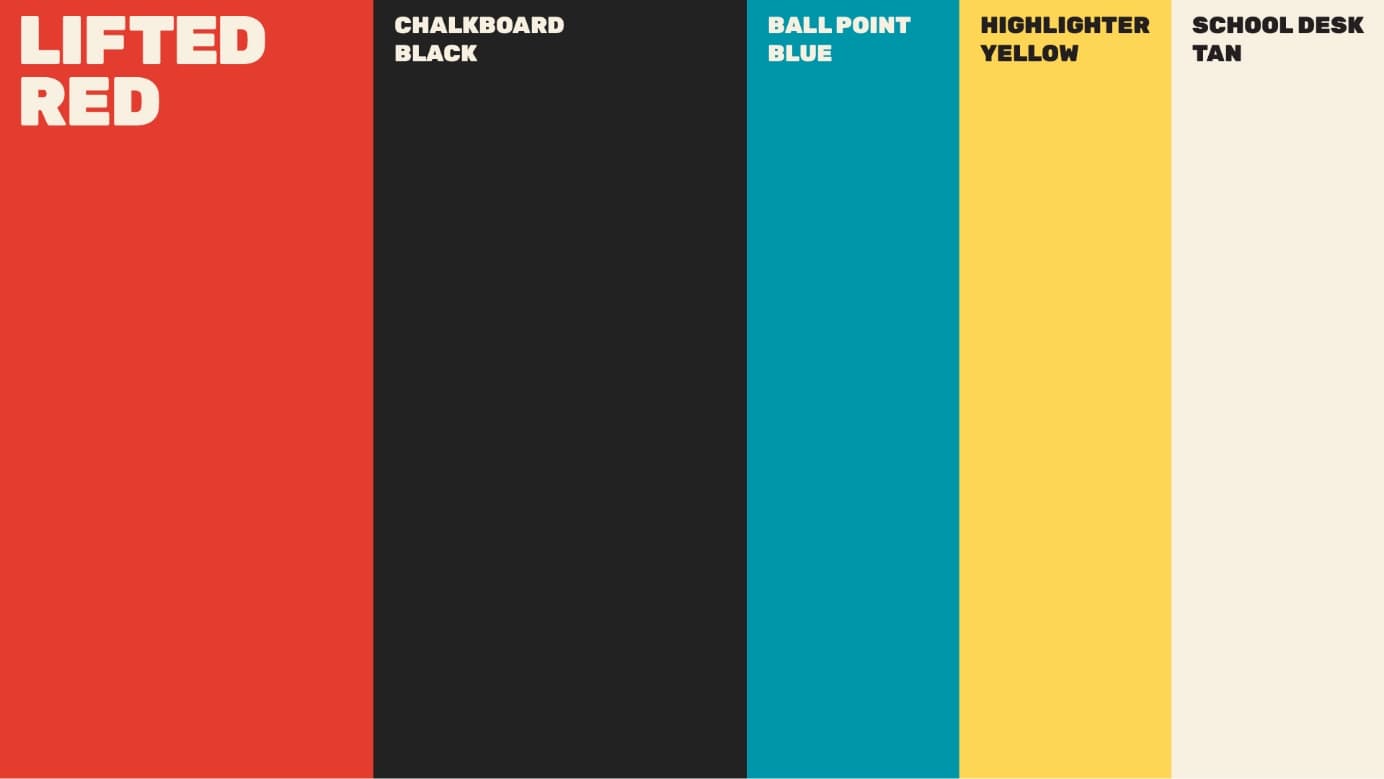
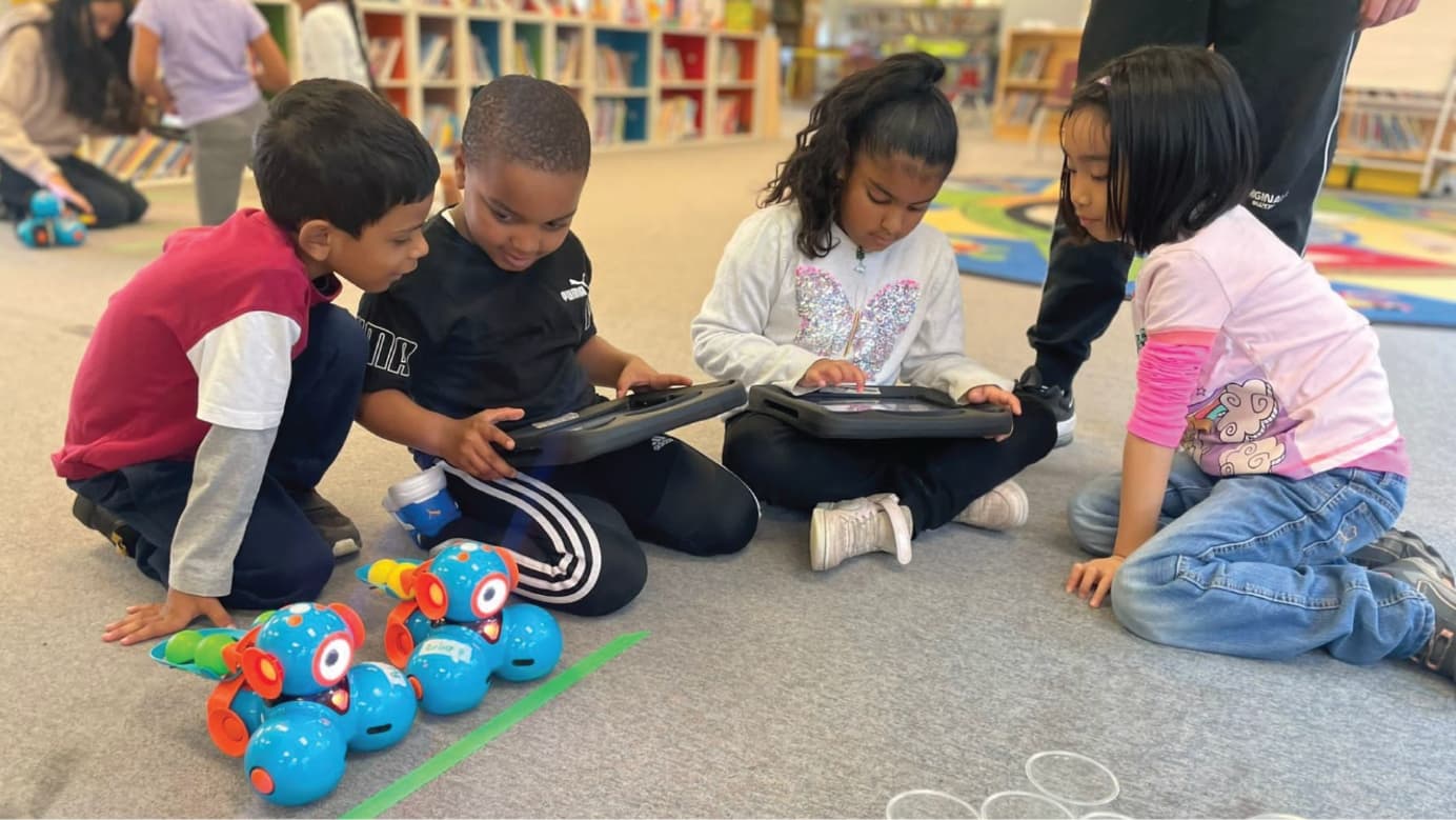
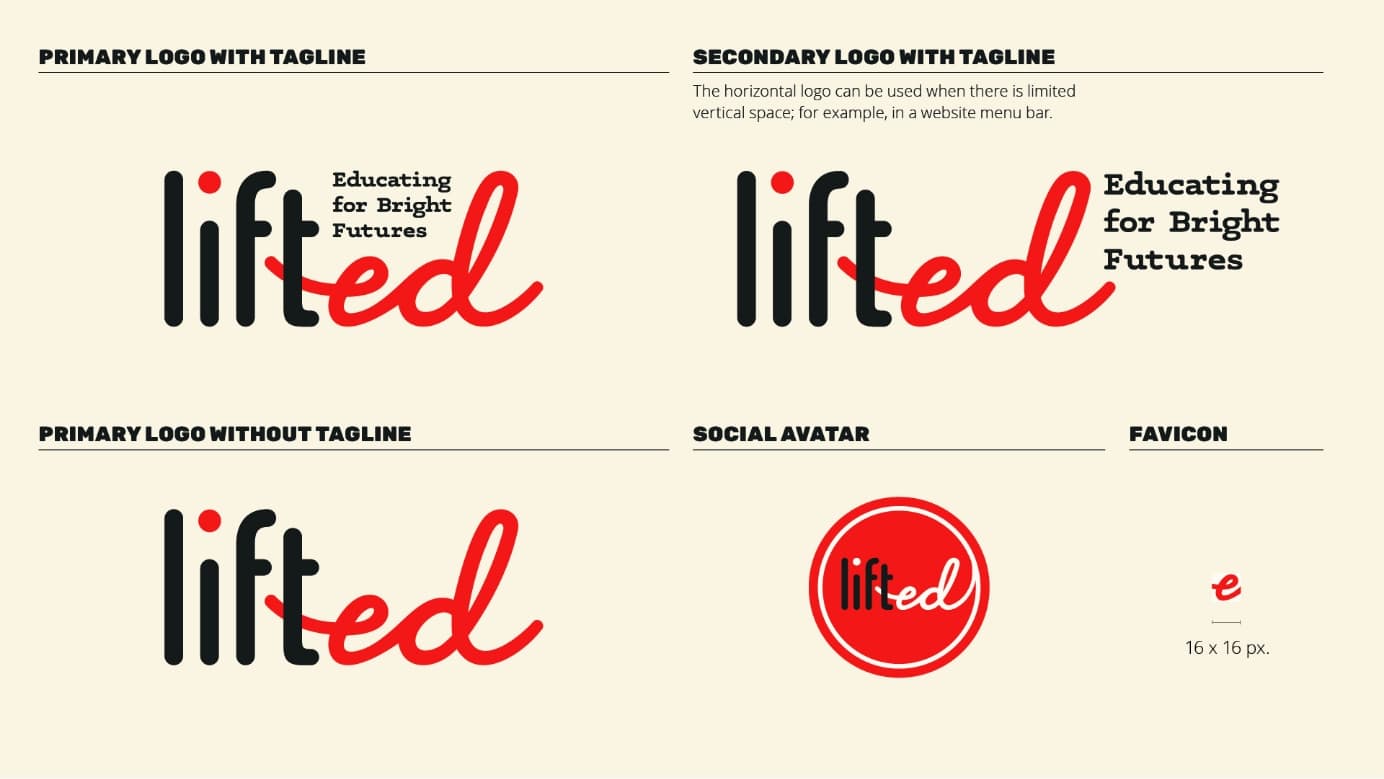
Working closely with the LiftED team, we developed a bold, modern and friendly wordmark and brand identity. A rounded sans-serif font, hand-drawn icons and illustrative system convey approachability, creativity and motion, while authentic photography portrays children and youth as capable and full of potential. A new classroom-inspired colour palette supports the system, balancing playfulness with a serious tone. Red was maintained as the dominant brand colour as a meaningful nod to the original Leacock Foundation.
We also redesigned and rebuilt the website to reflect the needs of LiftED’s diverse stakeholders and support the organization’s goal of establishing a credible, trusted destination to learn about the foundation and how to support its mission. Clear, accessible language and a flexible, scalable structure ensure the site remains true to the foundation’s origins while growing alongside the organization as its needs evolve.
Creating a fresh, optimistic brand and website that embody LiftED’s values and purpose as it evolves to serve a new generation of donors and students.